Adding a feature to an existing platform
Role: UX/UI designer
Duration: 12 weeks
Tools: Figma, Illustrator, Photoshop, Miro
Adding a feature to an existing platform
Overview
While Webflow has empowered designers to create responsive websites without code, the experience of managing design consistency across teams and projects remains fragmented. As teams grow, they often juggle style choices manually, rely on scattered documentation, and face misalignment—especially when onboarding new members. What’s missing is a unified system that brings structure, clarity, and cohesion.
Webflow has become a go-to tool for designers building responsive websites without code. However, as teams scale and manage multiple projects, maintaining visual consistency becomes difficult.
Currently, Webflow lacks a built-in style guide feature that allows users to define and manage global styles like typography, colors, and spacing. This results in manual work, inconsistencies, and slower collaboration, especially in larger teams or when onboarding new users.
Introducing a centralized, reusable style guide system could streamline workflows, improve team alignment, and ensure brand consistency across all projects.
Background
Turning Webflow (powerful design tool) into a scalable, collaborative workspace where teams can stay aligned, work faster, and create with confidence: a space that transforms scattered styles into a unified system, enabling creativity to flourish without the friction of inconsistency or manual upkeep.
The challenge
The solution
The solution consists of adding a new Style Guide feature to the existing Webflow platform. This feature enables users to create, manage, and reuse global styles, such as colors, typography, and spacing, across multiple pages and projects. By centralizing style management and automating updates, the feature helps teams maintain consistency, scale design systems efficiently, and reduce reliance on external tools.
To better understand how designers and developers manage styles and collaborate within Webflow, I conducted qualitative research combining:
Competitor analysis of design tools like Figma and Sketch
In-depth interviews with 5 UX/UI designers, system designers, and developers who regularly use Webflow or similar platforms
This research uncovered key insights about their workflow challenges, collaboration needs, and pain points around style consistency.
Research process
Identified challenges
01.
Webflow feels rigid; lacks flexible design system management.
02.
Builders like Wix/Squarespace limit creativity and brand consistency.
03.
Figma prototyping is less powerful compared to other features.
04.
No centralized style guides in no-code builders.
User needs
01.
Dynamic, centralized, and easily updatable style guides with global tokens (colors, typography, spacing).
02.
Real-time co-editing, version control, and improved communication tools.
03.
Easier asset sharing and organization.
04.
Pre-built, customizable UI component libraries and cross-project management.
Define
This stage was about translating recurring design inconsistencies and team misalignment into a focused product vision. Users didn’t need more customization—they needed structure, clarity, and a reliable system to support scalable, consistent design.
Turning scattered pain points into a single, clear goal: make design consistency effortless and scalable for teams working in Webflow. This insight shaped every design decision moving forward.
The challenge
How might we create a style guide system within Webflow that enables users to maintain visual consistency, collaborate effectively, and scale their design work so they can focus on creativity instead of repetitive, error-prone tasks?
To address the main challenges users face when managing design consistency and collaboration in Webflow, I focused on implementing realistic and feasible features that streamline workflows, improve clarity, and enhance cross-functional alignment between designers and developers. Each feature is designed to help users save time, avoid errors, and maintain visual coherence across projects.
Feature set
01. MUST HAVES
Create own style guide: ability to build and organize a custom style guide from scratch
Global style management: define and reuse styles (colors, typography, spacing) across projects
Simple templates and the ability to edit them
Define style guide elements (fonts, spacing, border radius, typography, etc.) and apply them to templates (or vice versa) and automatically apply these styles to pre-built templates
Custom template library for storing and reusing templates
Reusable system tokens: define tokens for colors, text styles, etc. that update automatically and globally when edited
Drag-and-drop functionality for managing styles easily
Style inheritance: apply styles consistently across multiple pages or projects
Basic components library: pre-made style components (buttons, headers, etc.) for quick and easy reuse
02. NICE TO HAVE
Real-time collaboration: multi-user editing with automatic syncing
Version history: track changes and revert to previous versions of the style guide
Style rule validation: automated checks for design consistency and accessibility
Export/import styles: export styles to other projects or import from Figma
Style guide sharing link: share a version of the style guide with clients or external collaborators
User personas
Based on research, I identified three user types with different goals, routines, and tech familiarity. These personas guided key design decisions to ensure the app fit real user needs.

Persona 1. UX/UI designer who values well-documented designs and strives for consistency across all projects to avoid mistakes and ensure accuracy.
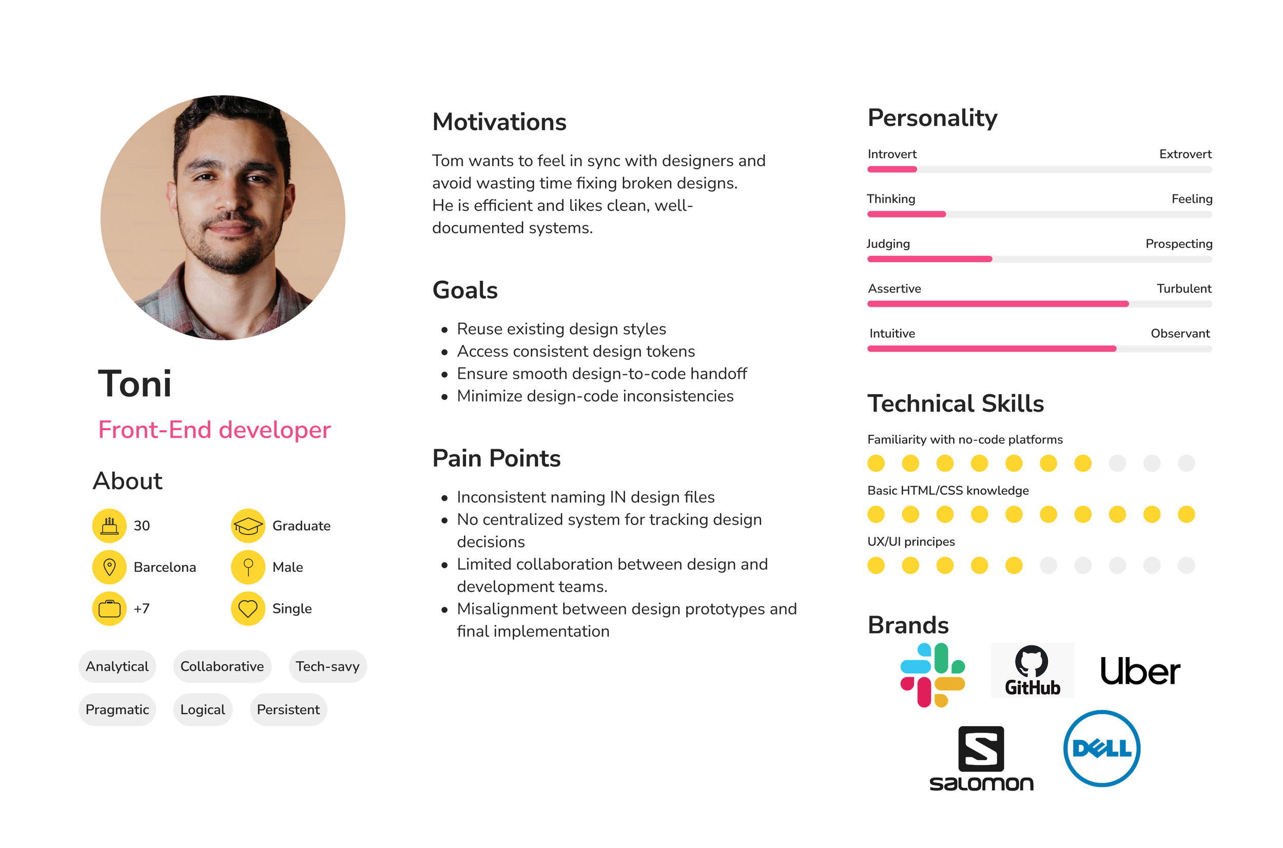
Persona 2. Front-end developer who needs to stay in sync with designers to improve efficiency and maintain consistency across all implementations.

Persona 3. Freelancer who wants to speed up their workflow by using components and variables, making their design process more efficient and consistent across projects.
Usability testing & iteration
To evaluate the usability of the new Webflow Style Guide feature, I conducted a moderated usability test with 5–8 participants aged 25 to 50, all with prior experience in web design or site creation. Participants were interested in improving their design workflow through better structure and consistency tools.
Each participant completed three core tasks within the Webflow prototype:
Create a style guide from a white canvas, exploring how intuitive it is to start with the style guide feature and seeing the option to import it from other tools like Figma.
Explore the process of adding components through the style guide panel by navigating to the "Components" section, trying out the drag-and-drop feature with predefined elements, or accessing your own component library. Save your custom design as a component and see it reflected in your library.
Customize a pre-built component using the right-hand panel and browsing for a font
Apply a saved style guide from their personal library to a component, testing the ability to maintain consistent design across projects by reusing previously defined styles.
The goal was to observe how clear and intuitive the user flows are for managing style guides, components, and templates, and to measure task completion rates, time efficiency, and user satisfaction.
Following the usability testing, I identified multiple opportunities to enhance the user experience and overall functionality of the app. Based on the feedback received, I implemented key improvements:
The most significant updates included:
Clearly indicate if editing a component globally or locally.
Clarify auto-save vs manual save and add visual feedback when saving or applying changes.
Add a clear CTA like “Start with Style Guide” when opening a project to announce the newest change.
Provide tooltips or info icons explaining terms like “component,” “template,” and “style guide.”
Allow pinning frequently used components or styles for quick access.
Key findings & design improvements
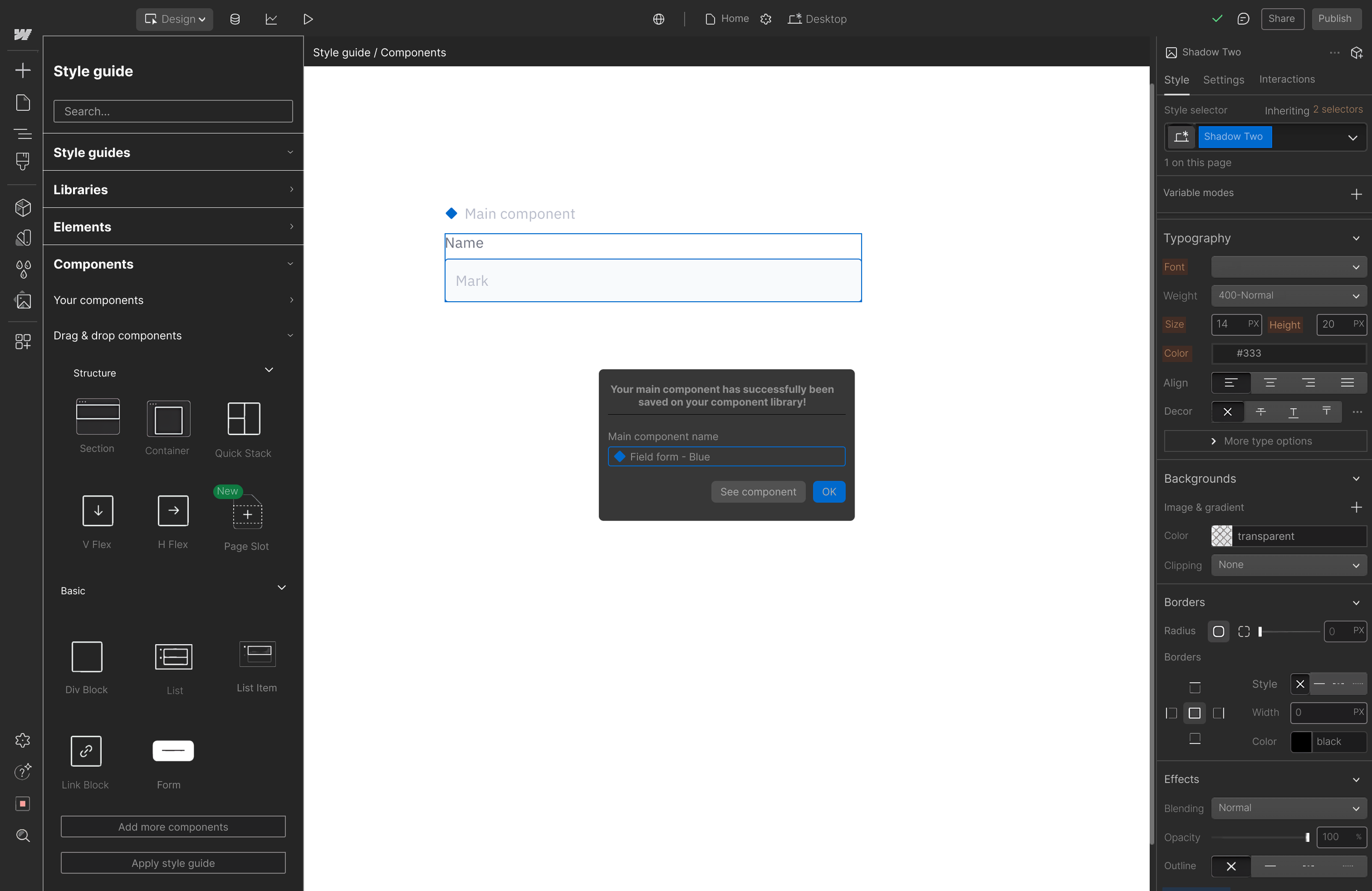
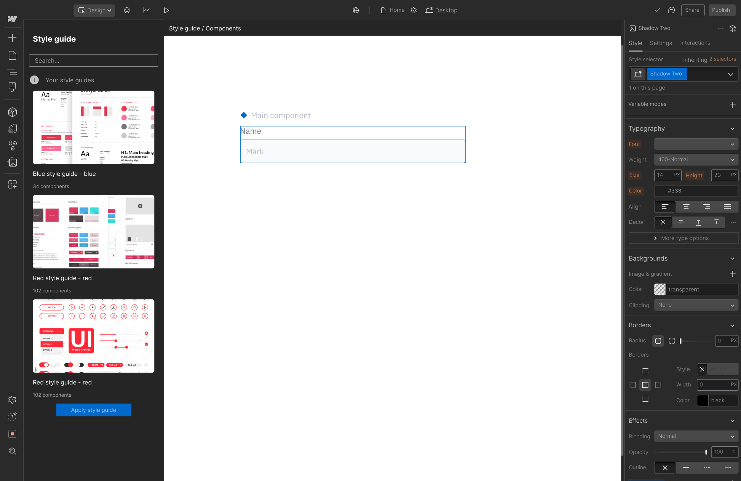
01/ Indicate if editing a component globally or locally
Clarified whether the user is creating or editing a main component or an instance to avoid confusion by adding a graphic element (a blue filled rhombus) when selecting a main component.
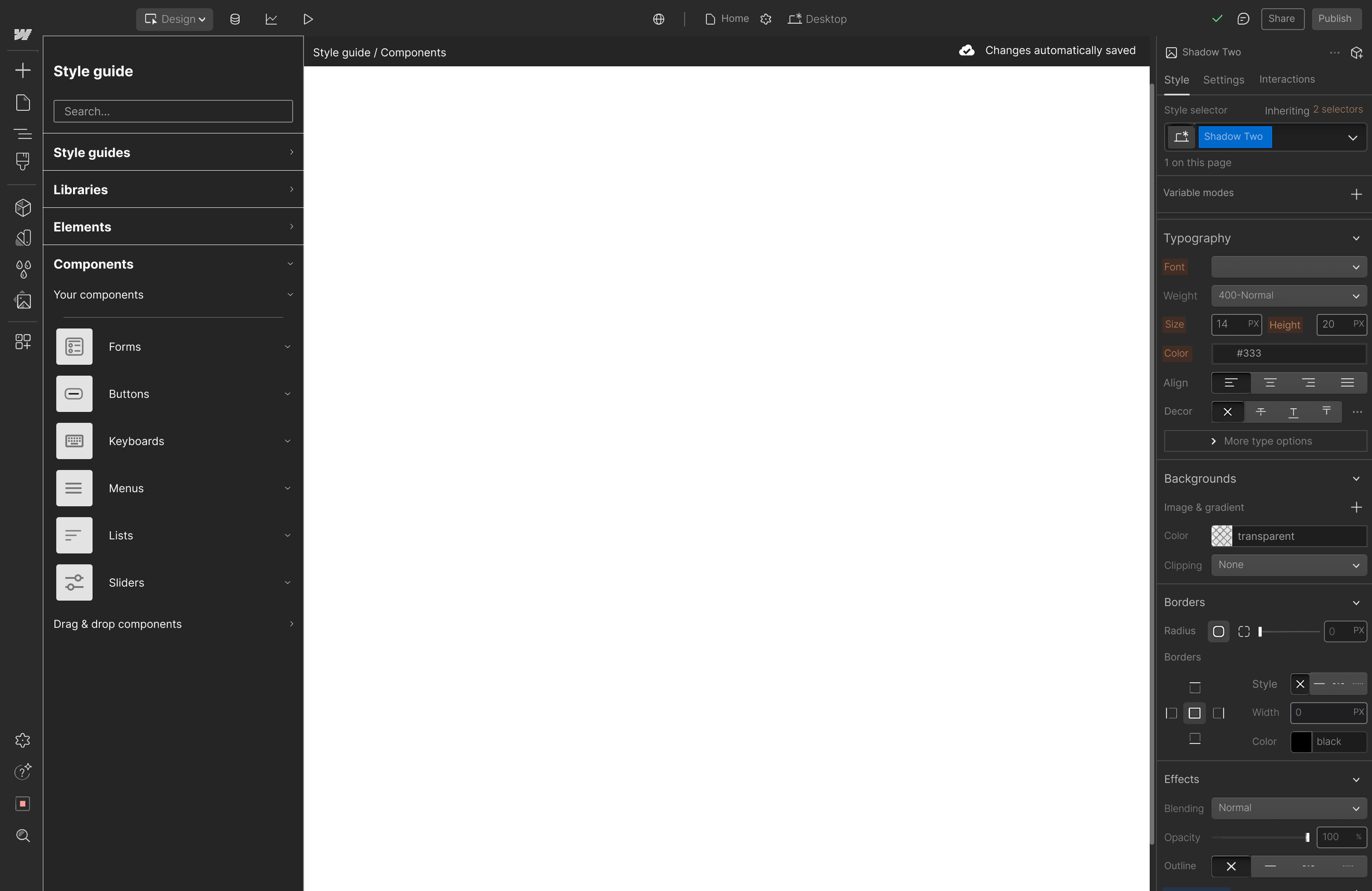
02. Adding auto-save and visual feedback
A cloud icon with a checkmark and the text “Changes saved automatically” now appears after each change on the top right corner of the screen, providing instant feedback and reducing user friction.
03/ Info tools added
An info icon button ("i") has been added next to unclear terms like “component,” “template,” and “style guide” to provide quick explanations and improve understanding.
This project started by recognizing a common pain point: as teams grow and projects multiply, maintaining design consistency in Webflow becomes increasingly challenging. Without a centralized style management system, teams spent valuable time manually syncing styles, risking inconsistencies that slow down collaboration and impact brand integrity.
Designing the Style Guide feature revealed how powerful centralized design systems can be in fostering alignment and efficiency. It reinforced the importance of building tools that scale with user needs, helping teams work faster and with more confidence. The biggest lesson was balancing flexibility with control, allowing creativity while preventing chaos.
Reflection
Futre development
Looking ahead, the Style Guide feature could evolve with capabilities like real-time collaboration, version history, and role-based permissions to support larger, distributed teams. Integrations with popular design and project management tools would further streamline workflows.
Additionally, introducing AI-powered suggestions for style harmonization and accessibility checks could elevate design quality and inclusivity. These enhancements aim to turn Webflow into not just a powerful design tool, but a collaborative workspace where teams thrive through seamless consistency and shared creative control.