End-to-end app
HobbyHub
Role: UX/UI designer
Duration: 12 weeks
Tools: Figma, Illustrator, Photoshop, Miro
End-to-end app
While interest in learning new hobbies is rising, the experience remains fragmented. Users jump between YouTube videos, online courses, and scattered forums, often alone. What’s missing is a sense of community, continuity, and human connection. The challenge was to design a platform that transforms isolated efforts into a shared, motivating journey supported by real people.
Overview
In recent years, there's been a growing interest among adults in learning new hobbies as a way to improve well-being, reduce stress, and foster creativity. According to a 2022 Statista survey, over 60% of people aged 25–44 actively seek new hobbies each year, especially after the 2020 pandemic.
However, despite this enthusiasm, many struggle to stay consistent. A lack of community, guidance, and motivation often leads users to abandon their goals early. In fact, over 80% of online learners drop out before completing a course (HarvardX/MIT, 2021).
HobbyHub addresses this gap by connecting users with mentors and local groups, creating a supportive and engaging environment that helps people stay motivated and committed to their learning journey.
Background
Turning a simple mobile app into a vibrant space where people can connect with mentors and local hobby groups, a place that encourages personal growth, real connections, and lifelong learning, all through a fun and emotionally engaging experience (offline and online).
The challenge
The solution
HobbyHub is a mobile app that helps users find mentors and local hobby groups, fostering real connections through a flexible subscription model. Designed with a user-centered approach, it blends gamification and emotional design to support skill-building and community. Features like progress tracking and encouraging messages keep users motivated, whether learning online or in person.
To better understand how people learn new hobbies and what keeps them engaged, I conducted qualitative research combining:
Competitor analysis of Duolingo, Skillshare, and Brilliant
In-depth interviews of 6 potential users of ages between 24-58 years who have tried to learn or were currently trying to learn new hobbies.
This research revealed key patterns in how users stay motivated, interact with content, and connect with others while learning, highlighting both opportunities and gaps in the current market.
Research process
Discover


KEY INSIGHTS FROM INTERVIEWS
Difficulty in finding quality resources
Feeling of disconnection
Limited expert guidance
Users value community and having guidance from a mentor or teachor when learning
People do hobbies mainly for their well-being
Many people prefer visual learning methods
This stage was about translating scattered frustrations into a focused product vision. Users didn’t need more content, they needed support, structure, and a sense of progress.
Define
Turning scattered pain points into a single, clear goal: make hobby learning feel connected, motivating, and worth committing to. This insight shaped every design decision moving forward.
How might we create a platform that makes learning new hobbies easier, more engaging, and community-driven, so users feel supported and stay motivated throughout their learning journey?
The challenge

To address the main challenges users face when learning new hobbies (lack of motivation, guidance, and community), I decided to include and focus on the following key features in the app. Each one supports users in staying engaged, finding mentors, and connecting with local hobby groups.
Core app features
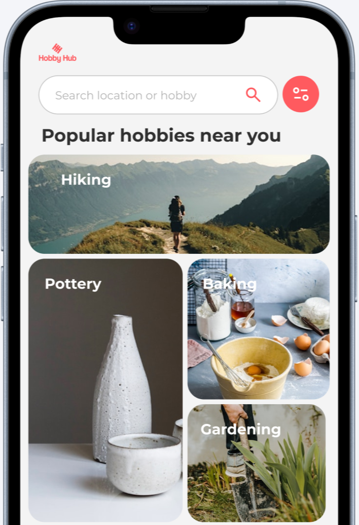
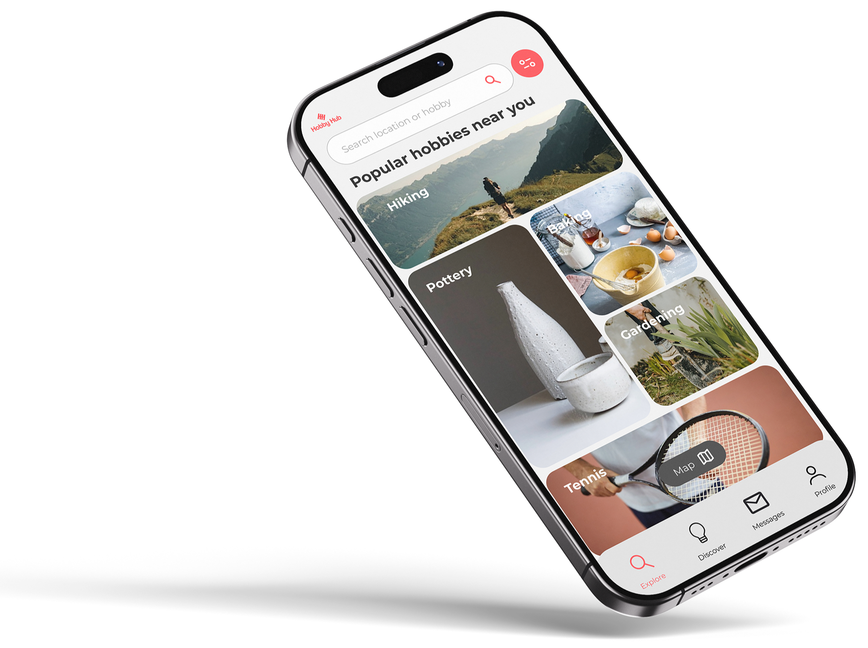
01. Localized search
Find nearby teachers and groups based on your location.
02. Community
Connect with like-minded people who share your hobby.
03. Mentorship
Users can learn with the guidance of experienced mentors.
04. Flexibility
Join and participate at your own pace with a subscription model.
Feature set
01. MUST HAVES
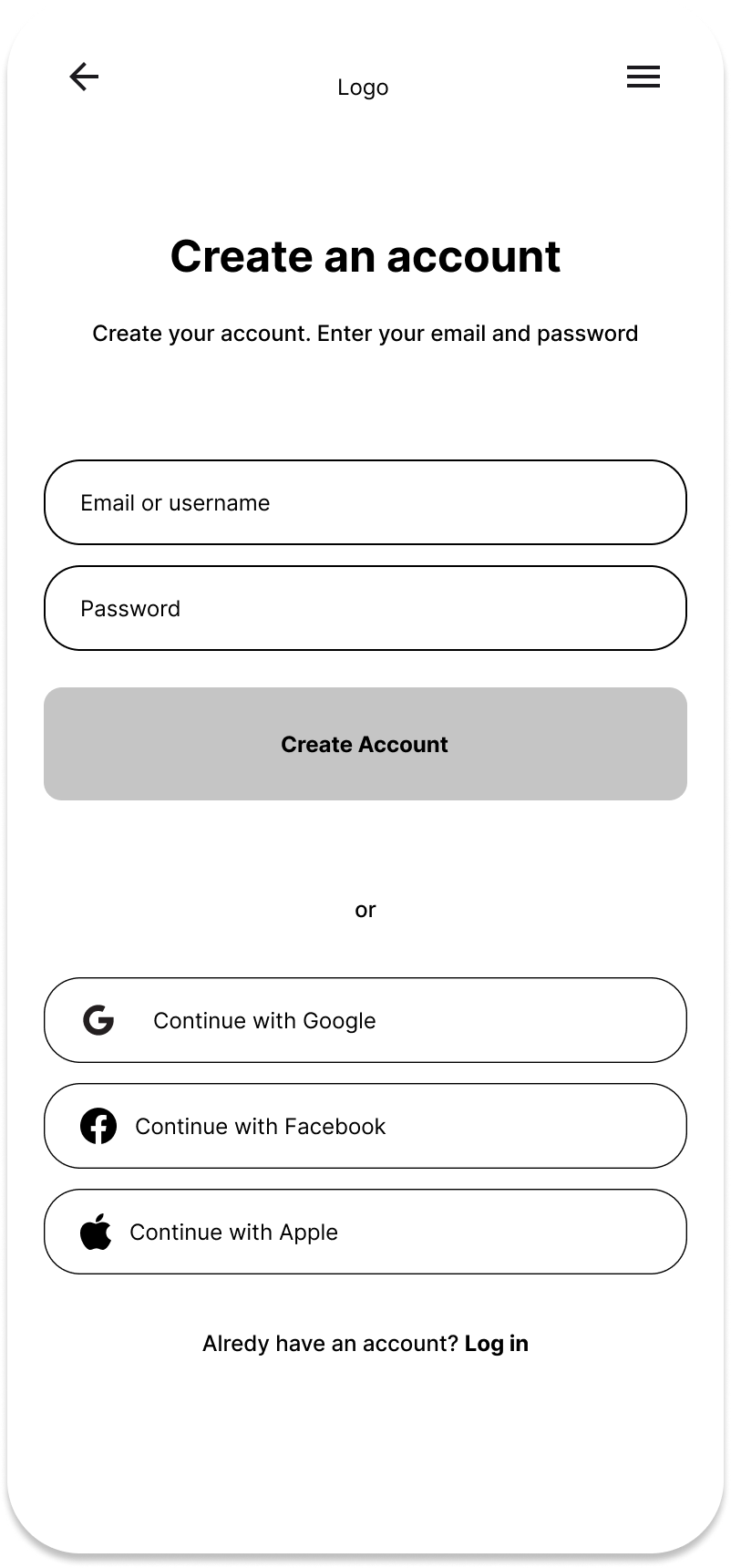
Account creation (for mentors and learners): User registration, sign in, log in and personal page with information such as learning goals
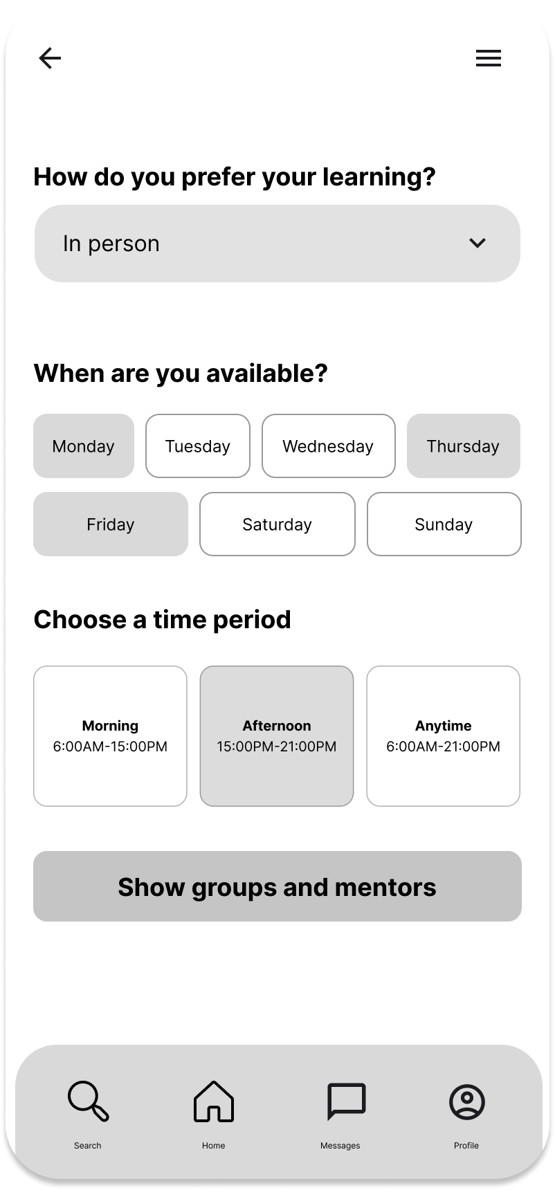
Search functionality: Be able to search by hobbies, location, availability
Mentor search and matchmaking: The app matches users to mentors based on preferences and other filters thanks to an in-app algorithm
Book and scheduling system: Users can book sessions with their mentors through a calendar
Interest-based group formation and meetups: Group creation based on shared hobbies, availability and location to organize real-life meetups
Communication tools: Mentor-learner communication channel so the learners can get help and guidance
02. NICE TO HAVE
Free trial version + subscription option: Option to choose between a free trial and the free version or subscription
Payment system: Secure subscription payment
Learning path: Designed learning path to help users progress in their hobbies
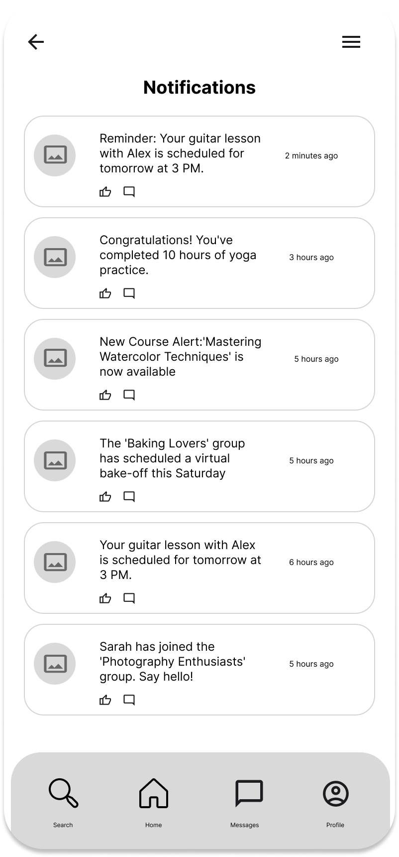
Notifications and reminders: Alerts for upcoming sessions, lessons, and for staying on track
Community features: Space to connect with other learners and share experiences
Calendar with to do’s and specific goals to achieve: Organize tasks and set goals in a clear and visual way
User personas
To ensure the product met real user needs, I defined three user personas based on research insights, each with different goals, routines, and levels of tech confidence. From a digitally fluent creative seeking new challenges, to a curious beginner overwhelmed by online resources, these personas reflected a range of learning styles and barriers. They helped guide design decisions that made the app feel intuitive for some, and gently supportive for others, balancing clarity, accessibility, and motivation across the board.
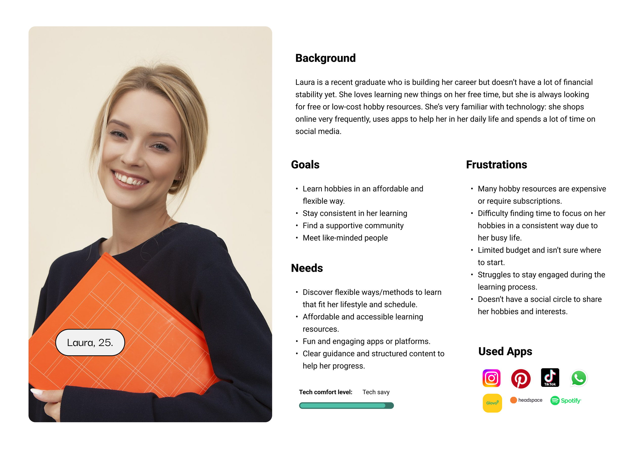
Persona 1. Tech-savvy young adult with a busy schedule. Looks for flexible, affordable ways to learn and connect with like-minded people.

Persona 2. Practical and efficient learner. Wants high-quality resources to integrate hobbies into a structured routine. Comfortable with tech.

Persona 3. Middle-aged with little tech experience. Now has more free time and wants guided, offline-friendly ways to explore new hobbies.
One journey doesn’t fit all, so the platform was designed to accommodate diverse paths and user needs.
Early interviews revealed users navigate their healthcare unpredictably, shifting tasks based on urgency and convenience. Instead of a fixed flow, I designed a flexible structure allowing users to move freely. Regular feedback helped me simplify the experience by removing unnecessary steps and refining key decisions, creating a user journey that mirrors real-world behavior.
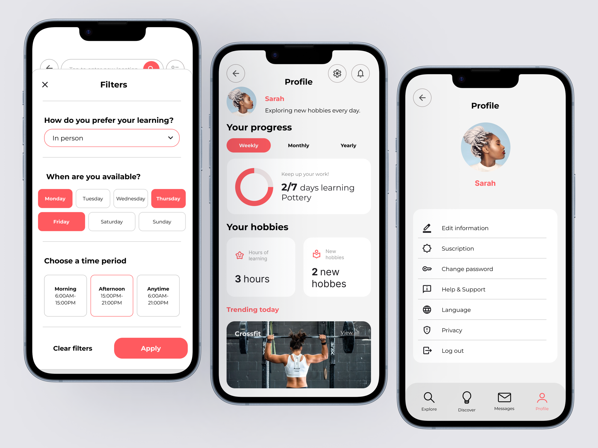
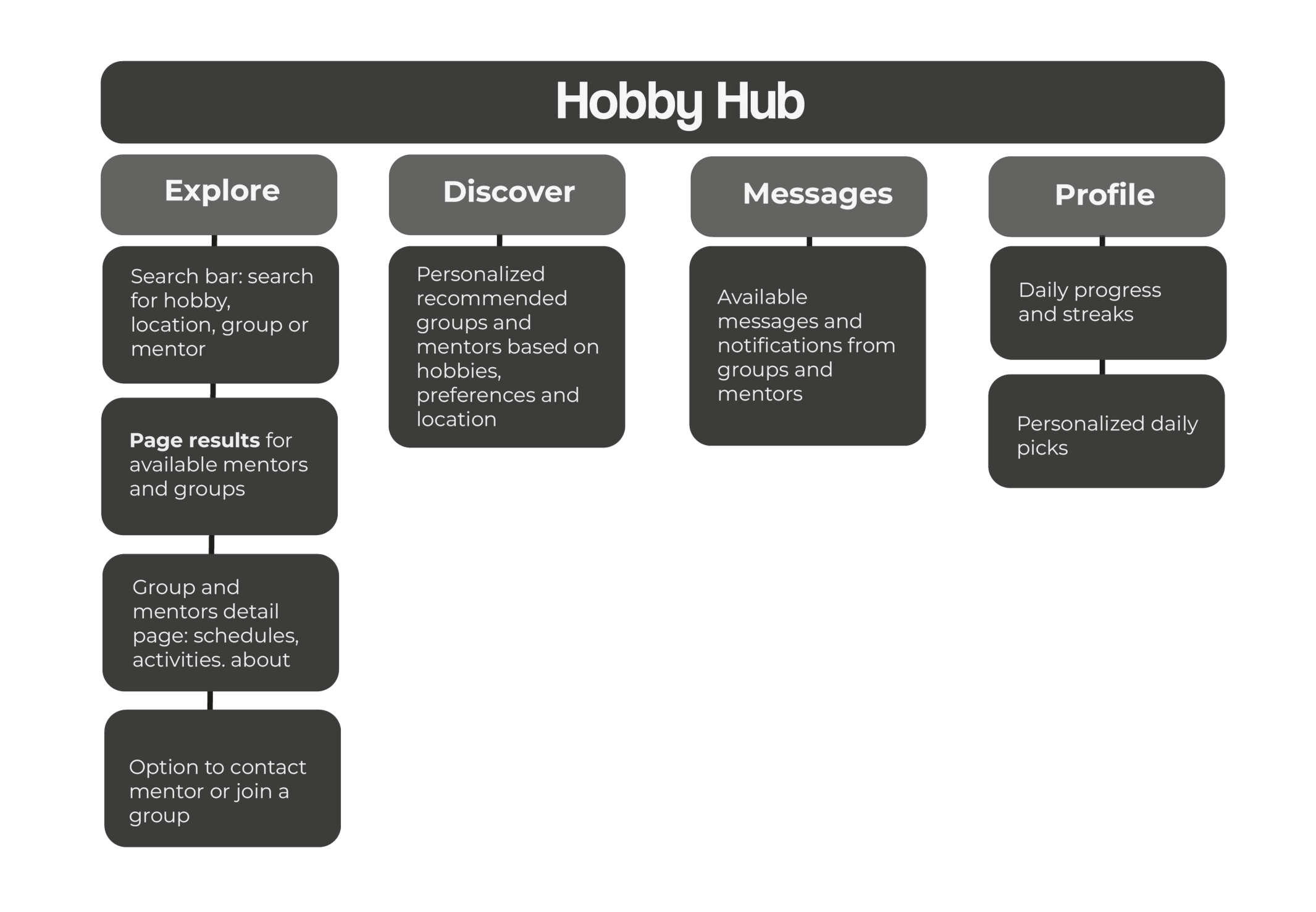
I organized the app’s content and navigation to ensure a clear, intuitive flow. I decided to center the experience around four main pillars: Explore, Discover, Messages, and Profile, to make navigation simple for all users and help them quickly find what they need.
Information architecture
Main user flows
Users search for a hobby, explore available local or online groups, and request to join. Once accepted, they can participate in group activities, share progress, and connect with fellow hobbyists.
User flow 1: Join a hobby group
Users browse mentor profiles based on their interests and goals, schedule sessions or send messages to initiate contact, and build a mentoring relationship that supports their learning journey.
User flow 2: Find and connect with a mentor


Desing & develop
I began with low-fidelity wireframes to define the core task flows: searching for a hobby, joining a group or booking a class, and finding a mentor. The priority was on establishing clear structure and usability rather than visual design.
This approach helped identify potential confusion and inefficiencies early, enabling iterative exploration without being limited by aesthetics.
01.
Hand-drawn sketches
02.
Low-fidelity wireframes
05.
User testing and iteration
04.
High-fidelity wireframes
03.
Visual design & brand identity
Visual design & brand identity

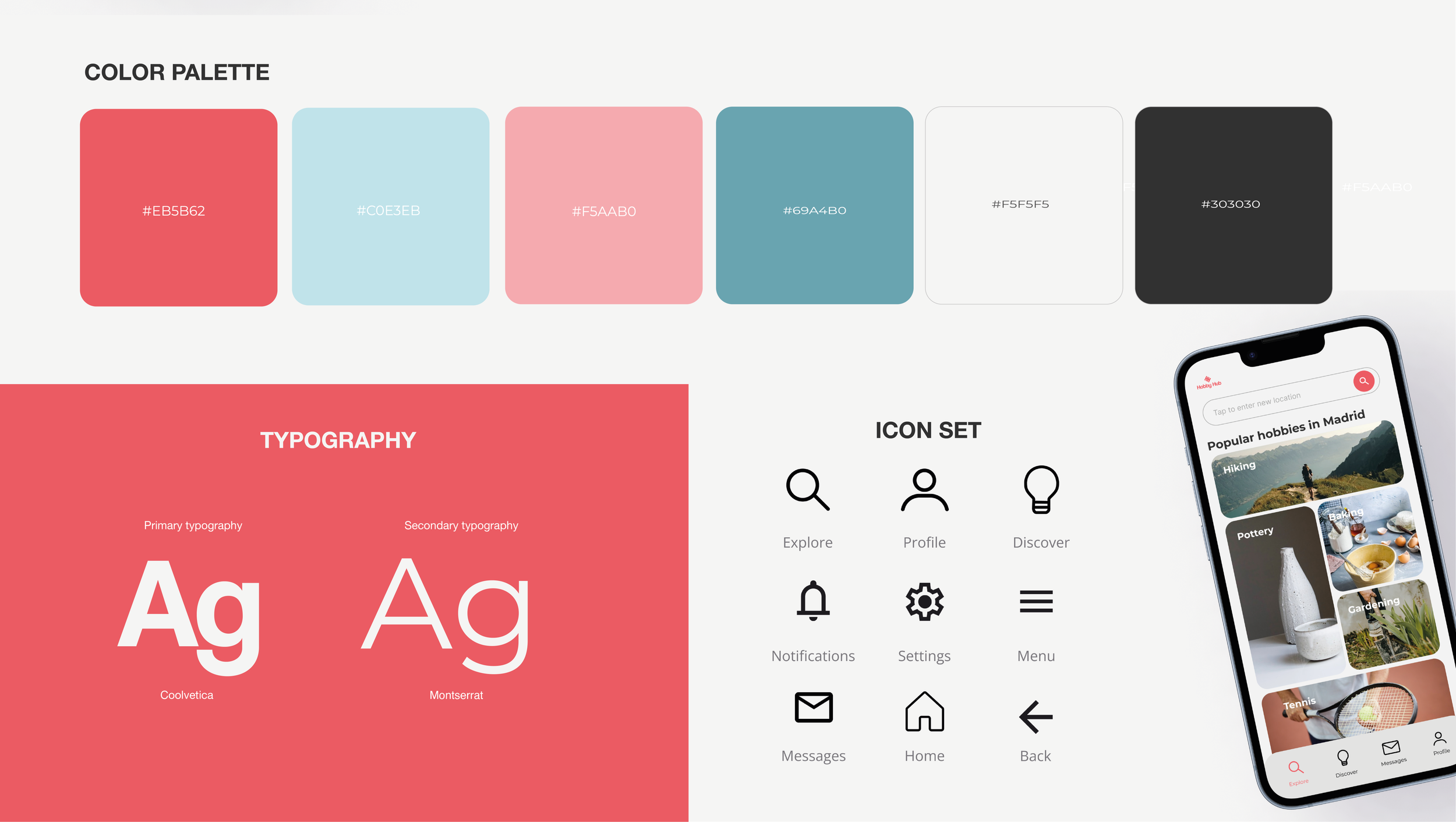
I developed a color palette that aligned with the app's dynamic and approachable vibe, using vibrant yet calming colors to create a welcoming atmosphere. The main color is this pink and the secondary color is baby blue.
For the typography, I chose fonts that were modern, readable, and versatile, ensuring that they would look good across different devices while enhancing the app's usability.
The logo needed to be simple, memorable, and represent the core values of the app, helping users connect with hobbies, mentors, and communities. The logo combines clean, modern typography with a subtle, playful symbol to reflect both the dynamic and approachable nature of the platform. This logo is adaptable and works well in different mediums, ensuring brand consistency across all touchpoints.
In parallel with the logo, I developed an icon set to ensure a consistent visual language throughout the app. The icons were designed to be simple and intuitive, representing core actions like "explore", "profile" "discover" "messages", notifications, settings, home, etc. By using familiar and minimalistic icons, I ensured that the user interface would remain clear and easy to navigate, enhancing the overall experience.
Once the core flows were validated, I progressed to mid-fidelity prototypes to refine interaction details and content hierarchy. User and mentor feedback informed targeted improvements to enhance clarity and streamline the experience.
Mid fidelity wireframes
Prototyiping, testing and iterations
To evaluate the usability of HobbyHub, I conducted a moderated usability test with five participants aged 24 to 58, from various backgrounds and experience levels. Each participant was asked to complete two core tasks within the prototype:
Find and join a yoga group nearby
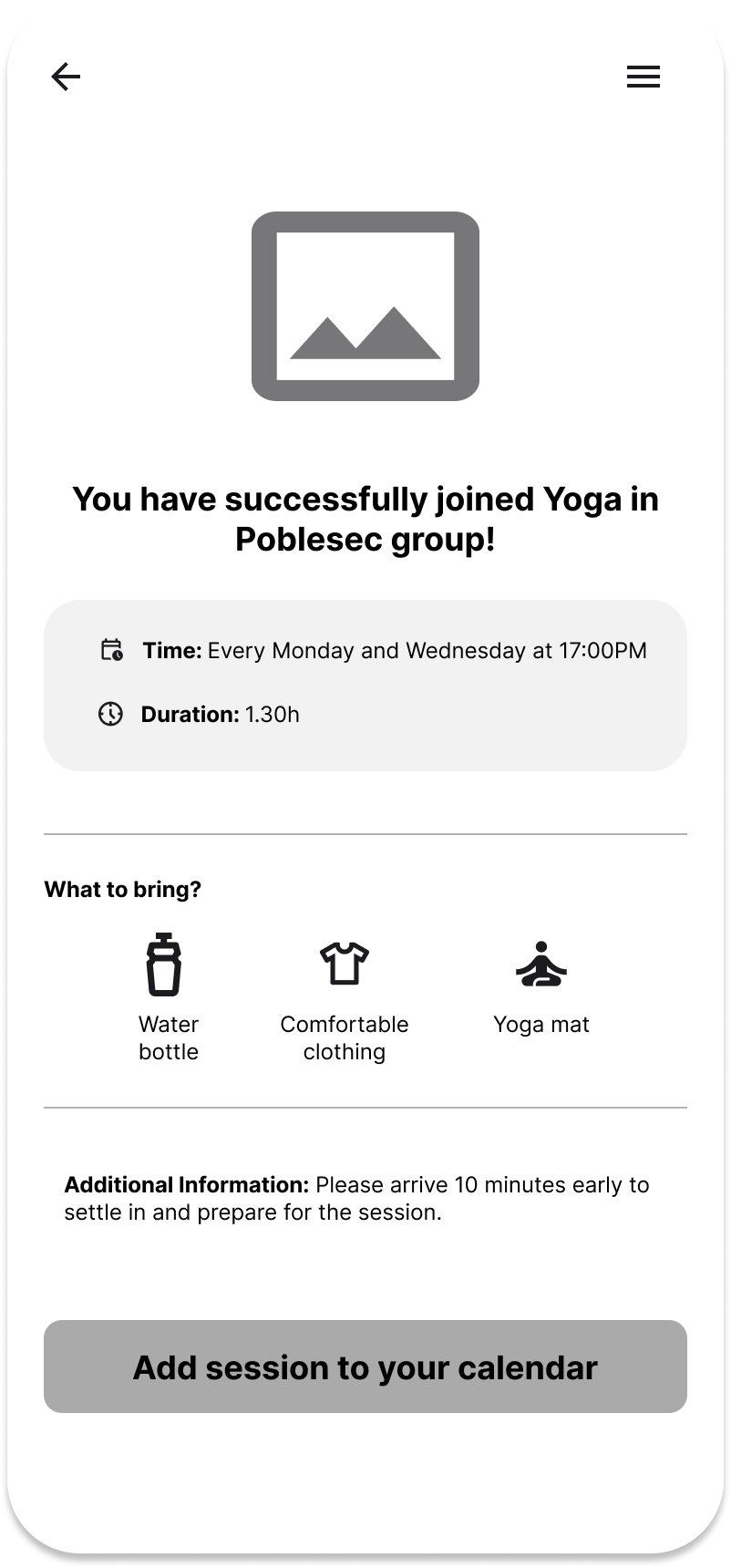
Search for a highly-rated yoga mentor and book a session
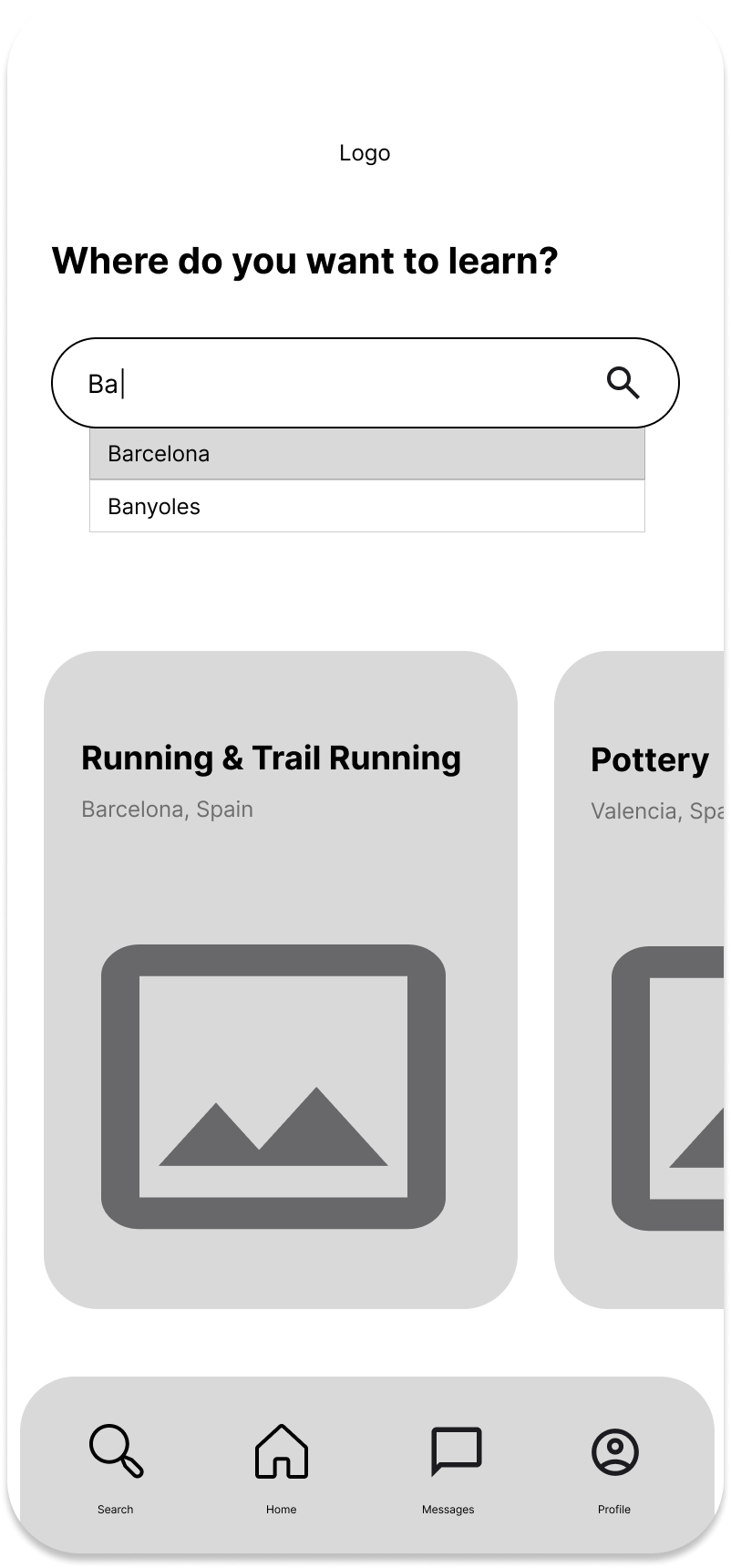
Following usability testing, I identified several key opportunities to enhance the user experience and improve the overall functionality of the app. Based on user feedback, I implemented essential changes to the wireframes focusing on usability, personalization, and information clarity.
The most impactful updates included:
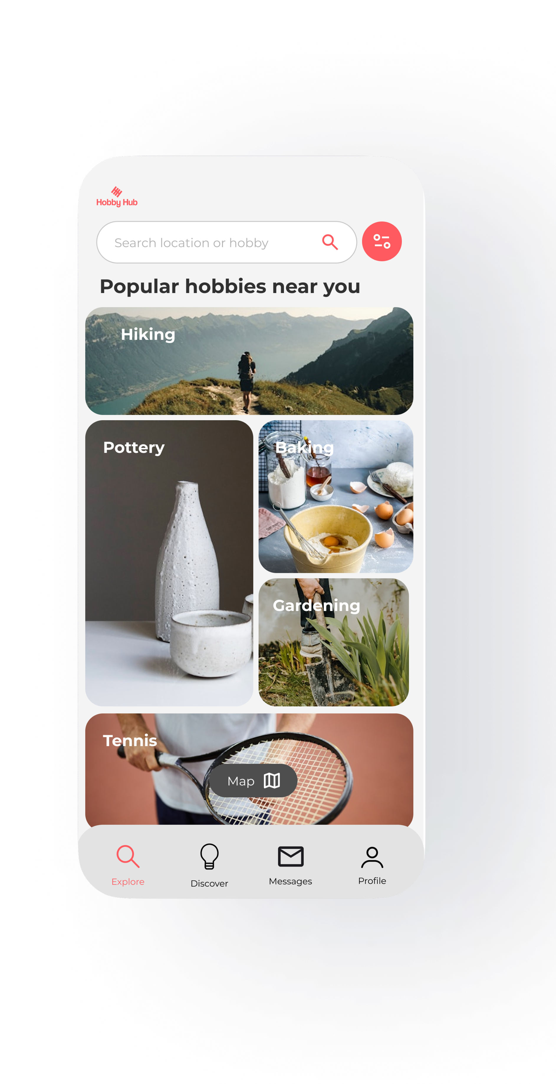
Setting the user's current location as the default to instantly show local hobbies without extra steps.
Adding in the search bar, the option to search by specific hobbies instead of only location
Integrating an interactive map to easily visualize nearby groups and mentors.
Making the filter step mandatory from the beginning to ensure more relevant results based on user availability.
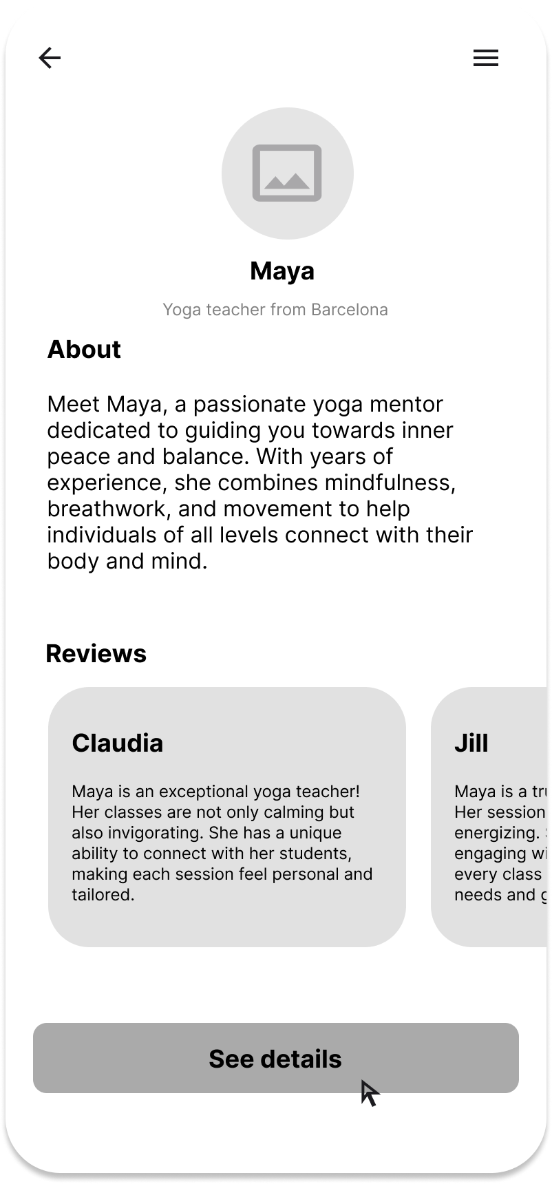
Expanding group and mentor descriptions with useful details such as schedules, ratings, and areas of expertise.
Key findings & design improvements
01/ User location default
Users found it difficult to enter their location each time they opened the app.
Set the current location as default allowed users to immediately see nearby groups and mentors, streamlining the experience.
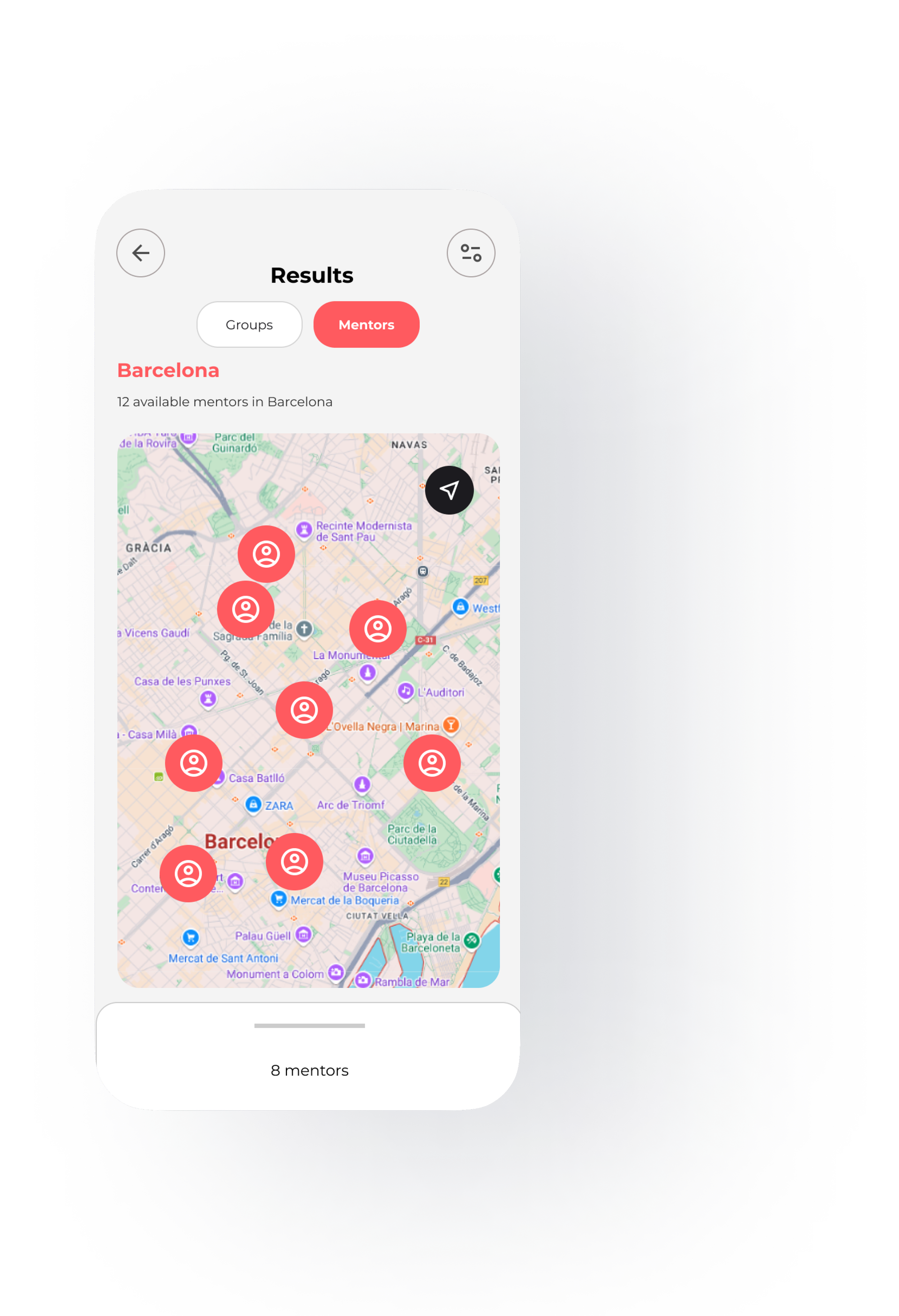
02/ Map integration
Users had trouble visualizing where each group or mentor was located.
I introduced a map view, showing nearby options and enabling better decision-making based on location and availability.
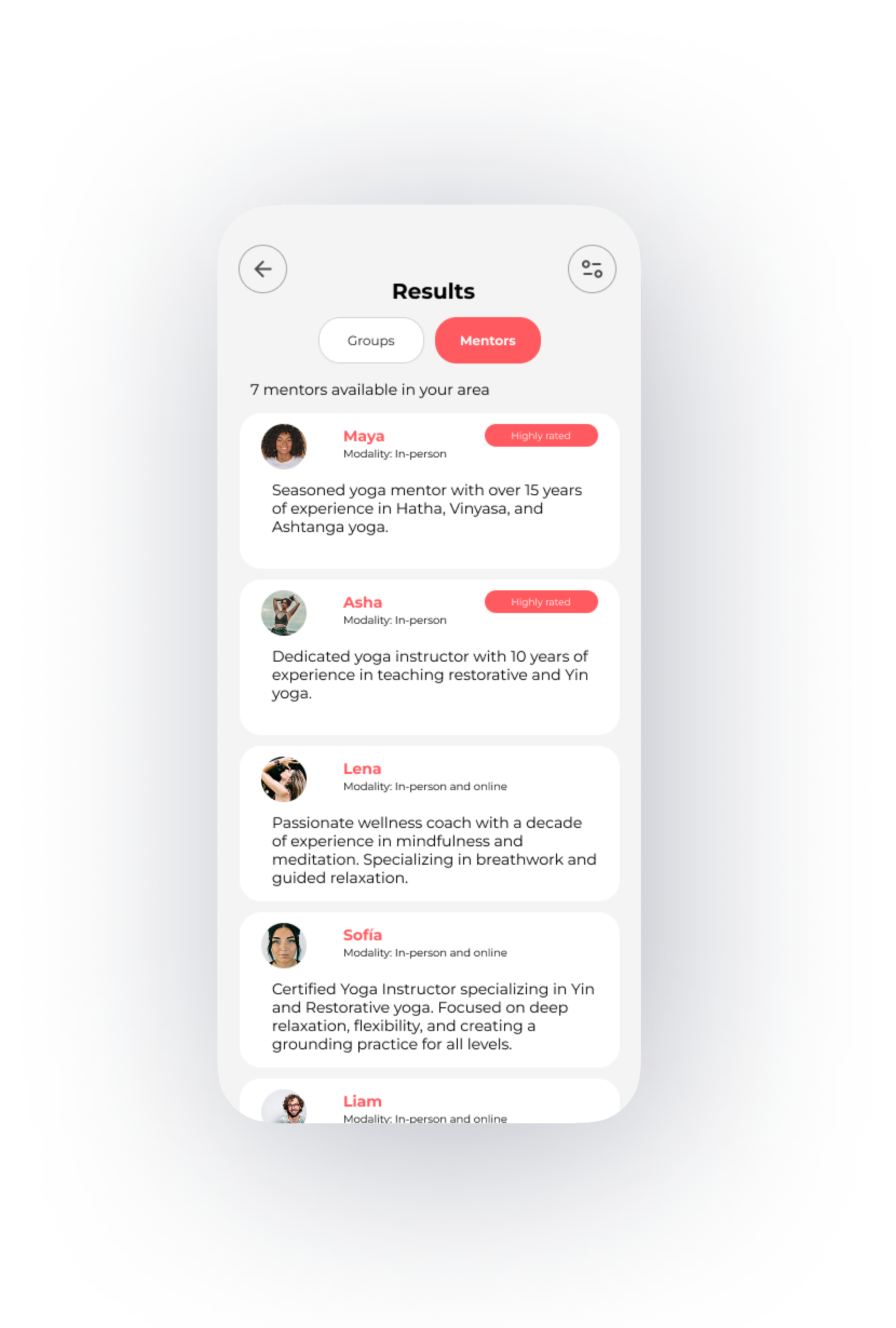
03/ Enhanced descriptions
Participants mentioned a lack of key details in mentor and group profiles.
I enriched these sections with schedules, ratings, specializations, and bios, giving users the context they need to choose confidently.
Reflection
This project started with a simple question: why do so many people give up on learning something they were excited about? Through research, I found that the problem wasn’t a lack of content, but a lack of connection: connection to a process, a sense of progress, and a community that shares the journey.
HobbyHub was born from that insight. It’s not just a learning platform, it’s a space built to support motivation, emotional engagement, and real-life connection, core elements often overlooked in self-paced learning tools. Designing with that in mind sharpened my understanding of how design can influence behavior, and reminded me that structure, encouragement, and delight are as critical as the content itself. The biggest challenge was balancing ambition with realism—choosing features that could be built and truly help users. It reminded me that good design isn't about adding more, but focusing on what really matters.
Futre development
There’s still room to grow. I’d like to expand the community features, refine the mentorship system, and test long-term engagement. I also see potential in adding nice-to-have or delightful features like learning paths, a compact notification/reminder system, richer gamification elements, and stronger community-based progress sharing. All with one goal: making hobby learning feel personal, motivating, and sustainable.